Frederick Fisher on select projects: Caplin House, MoMA PS1, Princeton's Eric and Wendy Schmidt Hall
May 7, 2025
As Founding Partner of FF&P, Frederick Fisher, FAAR, AIA is a self-described “liberal arts guy.” He is an avid reader, traveler, and arts-lover, and his approach to architecture reflects his innate intellectual curiosity and broad cultural and social perspective. His list of projects includes the renovation of Princeton’s Firestone Library, MoMA/PS1 in New York, The Annenberg Community Beach House, Sunnylands Visitor Center and Gardens, Erburu and Fielding Galleries of the Huntington Library, Art Museum and Botanical Gardens, and numerous galleries, studios, and homes.
Ahead of Fisher's May 12 Distinguished Alumni Lecture, AUD spoke with him about a few projects across his career. For more, check out our full conversation with Fisher.
CAPLIN HOUSE (1978) AND “THE SPACE IN THE MIDDLE”
You’ve described Caplin House as “filled with every idea I had ever heard in architecture school.” What does that mean?
I was interested in building a device for meaning. It had layers and layers of ideas and a very–I hate to use the word “artistic”–but a collage-like way of composing, of putting layers together.
At its heart, it had a very architectural idea. It’s a little Venice lot. The house fills up the whole lot. In the middle, it has its own courtyard–so it's like a little mini-village turned inside out. To this day, that's one of our most enduring ideas, which I just call “the space in the middle.”
That space in the middle was like a town square, and the walls surrounding it were like ruins. They weren't regular, or referring to anything specific; they almost looked like leftovers from something else. Intellectually, I was very interested in English Romanticism and the picturesque, the notion of using forms to carry meaning and to evoke poetic ideas. The English built fake ruins in their gardens to think about the transience of life, and this was a bit of a riff on that. And then there were little fragments of chain link fencing for handrails, and exposed construction. The overall house was this sort of metaphor of the owners. They are the site and the context. Loren is from Los Angeles and lived at the beach and Lori is French. She grew up on a barge in the Seine River. I was trying to evoke the memory of her childhood. The inside structure is done in a way like the underside of a boat–you look up, it's like a boat capsized over you. There's the courtyard. There's the English ruins. There's the exposed construction, and the facade was right out of my Oberlin art background, when I realized I was not going to be an artist. I was interested in the Surrealists, Kurt Schwitters. It's a pure collage of different colored tiles and shapes and different types of windows and angled canopy, and this asymmetrical wave-like curve of the roof. And it was not rational.
MoMA PS1 RENOVATION (1994), AND SPACES FOR ARTISTS
What was the hierarchy of priorities when you're thinking about a space for modern art in 1994? Does “modern” have to evolve?
That word never entered into my mind or the conversation. The building opened in 1995, but you have to remember it was designed ten years earlier, so it's really an 80s design, not a 90s design. I couldn't even imagine 1995 when I was designing it.
To me it was: I know these artists. I was like, “I get it.” I talked to a lot of artists who said, “Don't fuck it up.” They loved it for what it was and they wanted to play rough with it, and they didn't want it to be precious and they didn't want it to be rational.
It was a competition for that job, and there was another architect approaching it from the standpoint of: This is a really complicated, messy building; how can we clean it up and rationalize it? And my response was, How can we embrace that mess and that complexity and give that back to the artists and the curators and let them play with it and let them tell us about it and reinterpret it, and we’ll not spend a lot of money. That was, if I do say so, the right answer.
The first exhibition catalog for PS1, it's a kind of a legendary catalog, called “Rooms.” The founding director, Alanna Heiss, went out and got a bunch of her artist friends, and they just went into the building and did all these crazy installations in a wreck of a building in what was a tough neighborhood at that time. And Carl Andre said what he likes about PS1 is that it's about production, and he said art thrives on production and art dies of consumption. Making art is basically an industrial activity–and that's why artists love those spaces. The art feels right in them.
PRINCETON UNIVERSITY’S ERIC AND WENDY SCHMIDT HALL, AND SPACES FOR EDUCATION
When you're designing a space for education, for the production of knowledge–what does that space need to show? That messiness of knowledge production–does that enter in some way?
I love academia. That's home. I like the people. I like the thinking. I like the fact that they have hugely interesting buildings done over a long period of time. So there's layers; every generation builds a building for their generation, and then they all mix together on the campus. And I love that layering.
With a project like that, there's two clients, maybe three. One is the future. Then there’s the owner, which is the university or college. And then there's the tenant, which is the student and the faculty. You’re designing for all three of them at the same time, and sometimes you have to remind one or more of them about the other ones. You might be designing for students and faculty today, but there's going to be somebody else in this classroom 50 years from now.
I've had the great, great privilege and pleasure of working at Princeton for now 18 years, multiple buildings. Ron McCoy is the current campus architect. He's been there for most of that time. And one of his aphorisms that I love is: one thing we do really well here is think about things. Another one was: We've been here for 250 years, and we plan on being here for another 250 years, so keep that in mind.
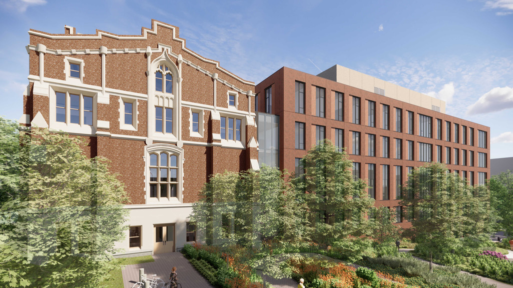
We have a building at Princeton, our latest building, our biggest project ever–a quarter of a million square foot computer science building, and half of it is a1909 Gothic Revival science building, and the other half is a mass timber factory pushed up against it, surrounded by three Robert Venturi and Denise Scott-Brown buildings. It's a complicated program: two very different building types and a very constrained site. And the answer was–essentially, a Ford factory by Albert Kahn plus a beautiful Gothic Revival building. There's two things at once. There is Victorian brick with arched windows–Princeton has many brick buildings. It's in the core campus. And on the other side of it is a Venturi-Scott Brown building with its wallpaper-like facade. And so, what do you do between those two things that also complements, functionally, the study of computer science? What's computer science going to be like in 10 years or 20 years? I have no idea. But I do know that those people in Silicon Valley, they love their loft spaces, just like the artists do. They want authenticity. They want warmth. They want flexibility. And they want efficiency.
And so that building is the simplest, most compact building and I would venture to say it's the only solution that would have met the budget, and fit on the site–simpler, simpler, less, less. And it came down to: There's these four points that determine the site. We can't go past these points. We have a little bit of flexibility here. And maybe we need to grab this window into the new wing where it can connect to an internal street . And then we're going to squeeze five levels into what really is the four levels worth of space. And that way we don't have to add more than one elevator to the building and one extra stair. We can add 130,000 square feet with one stair and a pair of elevators. And it finally came to be this slightly weird trapezoidal shape with a very compressed, complicated section. But in a way, it was the smallest building that could solve the problem. And miraculously enough, it's under budget, too.